The Best Wedding Website Templates (For You + Your Guests)
If you click to purchase a product or service based on our independent recommendations and impartial reviews, we may receive a commission. Learn more
“It’s important that your wedding website template reflects the special day you have mind.”
But with so many wedding website templates to choose from it can be hard to know where to start.
Don’t believe me? Here’s a few to get you started…
Now, we could show you a load of wedding website template designs and let you get on with it.
But that’s not how we do things here at Website Builder Expert!
Instead, this guide will:
- Show you a selection of the best wedding website templates around.
- Explain the essential things you need on a wedding template to save time, money + effort.
By the end of this guide, you will have a clearer idea of the best wedding website template for your special day.
If you haven’t yet chosen your site builder, compare our best website builders in the table below to help you make your decision:
OVERVIEW OUTLINE
Click on the following links to read the specific sections:
KEY THINGS THE
BEST WEDDING WEBSITE TEMPLATES HAVE
“You probably have a clear idea of how you want your wedding website to look, which is great – but looks aren’t everything!”
Yes, the design of your wedding website template is important. But so is staying on budget and making the best use of your time.
Using a wedding website template is the smartest way of saving yourself both time and money.
They have all the features you need and you can use them straight out of the box – saving you a lot of hassle down the line.
But this doesn’t mean you can’t put your own spin on things!
You can edit every template we recommend to better reflect the wedding day you have in mind.
The best wedding website templates will include:
- A way for guests to RSVP
- On the day logistics and details
- A map for directions
- An in-built Registry
- A gallery for photographs
- A way to tell your story
1.A way for guests to RSVP
“While it’s nice to send and receive paper invitations, it can be hard to track and manage guests RSVPs. The best wedding website templates keep things simple by letting your guests respond immediately through your wedding website”
One of the main concerns when planning your wedding will be the budget – Guest numbers has knock-on effects for food, seating, reception venue, and any number of other factors – so you don’t want to wait around for RSVPs to trickle in.
Using a wedding template with out-the-box RSVP functionality is definitely the smartest way to keep your budget and guests organized.
Just think about how much time, money and stress you could save by committing to venues and caterers sooner rather than later!
Ensuring there’s an RSVP form on your wedding website template makes it easy for guests to confirm if they are coming. Being able to confirm numbers can save you time + money as you’ll be able book venues and caterers earlier.
2.On the day logistics and wedding details
“The wedding templates in this guide make it easy to communicate logistics like venues, start times, accomodation details, etc. directly to guests.”
Your wedding website is the ideal way of getting friends and family excited about your special day. But unless your guests know where to go, what time they need to arrive and whether they need to sort accommodation or not – you might end up celebrating by yourself!
Keeping your eyes peeled for wedding website templates that effectively communicate important information is a must – whether it’s a multi-page design or a one-page, long scroll design. We’ll look at different types of wedding website template designs below.
It’s also worth thinking about whether you need (or want to) communicate all of the above. For example if you’re having a smaller, more personal wedding with only a handful of guests, you may not need to worry about ‘things to do’ or ‘accommodation’ information.
Choosing a wedding template that communicates information clearly can be a real life-saver as the big day approaches. Look out for designs that have a page set aside for important info, or enough space for you to add it in.
3.Directions to the venues (ideally with maps!)
“If people can’t find your wedding venue, then both you and your guests will end up disappointed. Opting for a wedding website template that clearly spells out where the venue is (and ideally shows you where on a map!) is key.”
In order to share your special day with friends + family, it’s really important that your wedding website clearly communicates the location of your venue and reception to guests.
The best wedding website templates will have space set aside specifically for you to share essential travel information and often include a map to ensure no-one gets lost.
Imagine how convenient it would be for guests to have a map a few clicks away on their smartphone. It would make arranging travel plans much easier and also hopefully minimize late arrivals.
Providing directions to your venue lets guests make their own way to your wedding. It also means you won’t get loads of phone calls, texts, and whatsapps on the day asking how to get there.Our recommended wedding website templates (below) all include dedicated travel pages. Most also include a map for added clarity (or provide the option to add one if needed).
4.An in-built Registry
“Having an integrated registry on your wedding website template makes gift-buying super simple for your guests. It also ensures they don’t buy something you don’t like or need!”
By choosing a wedding website template with an integrated registry, you’ll be able to simplify life for everyone involved.
You can quickly register the stores you’ve opted for (e.g. Bed, Bath & Beyond, Amazon, etc), highlight the gifts you like the most, making it easy to purchase the right one – saving guests time and effort, while preventing confusion.
Ensuring your wedding website template can integrate your registry choices will make life simpler for everyone. It lets you flag up the products and experiences you value most, making gift buying as easy as possible for your guests.
5.A gallery for photographs (or the option to add a gallery!)
“Adding a gallery to your wedding website template will make it easy to share happy memories from your engagement right through to the bleary-eyed smiles of your guests at the end of the reception.”
Everybody loves a photograph, whether it’s a #nofilter Instagram snap, or a new photo tag on Facebook – we all love saving happy memories to reflect upon.
The best wedding website templates will have a dedicated space for you to store and post your photographs to – or at the very least, they’ll make it easy to add one to your site.
And if you’re not satisfied with the default gallery on your template, then it’s really easy to tweak how it looks. Just double click and tweak the settings, or drag in another gallery/display option from the toolbar in your editor!
It might even be worth considering paying for a premium plan. This is a great way of increasing your storage so that you can upload even more photographs, or even include snaps from guests.
Photographs are a fantastic way of capturing and sharing memories from your wedding. The best wedding templates will include galleries, slideshows, frames, mosaics, and more for your snaps. If you’re in a rush, you can just use the default frames on the template – simple and efficient.
6.A way to tell your story
“The best wedding website templates don’t only communicate on-the-day logistics, they also show your love off to the world”
Wedding website templates can bring your romantic story to life through photographs, by revealing information using on-page scrolling, or even with simple, understated blocks of text.
You can stick with the default template design or play around with it and tell your story in a truly unique way.
The best wedding website templates will almost always have space set aside for you and your partner to tell your story – and why shouldn’t it?! This is your opportunity to put Romeo + Juliet to shame and show off your love to the world. Look out for interesting ways of sharing your joy through photographs, text or a combo on the two!
Further Reading
The Best Wedding Website Builders – We look at the best wedding builders for your big day. Our recommend platforms will help you create a truly memorable wedding website.
How Much Does A Web Site Cost? – In this discussion, we look closely at how much your website should really be costing you!
THE BEST WEDDING WEBSITE TEMPLATES
“Your wedding website template should reflect the day you have in mind and include all the essential information to keep your life as stress-free as possible.”
But with so many templates to choose from, where on Earth do you begin?!
To make life easier for you, below you’ll find our rundown of the best wedding website templates from our recommended wedding website builders.
Our hand-picked templates below take into account the six essential things you now know your wedding template needs. They contain the key features, are easy to edit, and look absolutely beautiful.
1) Wix Wedding Templates (110+ million websites)
“Wix is our number one wedding website builder because it makes building a wedding website as easy as possible.”
Wix has over 500 professionally-designed templates to choose from, of which 23 are designed specifically for weddings.
Wix’s designs are fun and eye-catching, with bold, colorful designs sitting alongside more classical, clean + white templates. Whatever the theme and style of your wedding, you will definitely find something that’s to your tastes with Wix.
And if you don’t?
Well, thankfully Wix’s editor is super simple to use so you can customize any template as much as you want in order to make it yours.
“Romantic Wedding Invite” Template
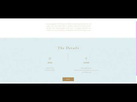
The Romantic Wedding Invite template is a lovely one-page design, which means guests don’t have to click around to find information, they simply scroll down – keeping things nice and convenient.
| Has this template got…. | |
|---|---|
| Multiple pages or is it single-page-scroll? | Single-page-scroll |
| A way to tell your story? | ✔ |
| A way for guests to instantly RSVP? | ✔ |
| Space for on the day logistics and details? | ✔ |
| Space for venue information + directions? | ✔ |
| An optional map for directions? | ✔ |
| An integrated registry? | ✔ |
| A gallery for photographs? | ✘ (easy to add) |
| Freedom to customize this template? | 9/10 |
“Funky Engagement” Template
I really love the quirky and fun style that the ‘Funky Engagement’ template offers. It’s very effective in conveying all the essential information on the homepage by using cool graphics and dotted lines to guide guests through each step of the big day (while subtly reminding them of the things they need to organize!)
For what it’s worth, I really think that this template is a great option for any couples looking for an eye-catching wedding website that also makes life incredibly easy for your guests.
| Has this template got…. | |
|---|---|
| Multiple pages or is it single-page-scroll? | Multiple pages |
| A way to tell your story? | ✔ |
| A way for guests to instantly RSVP? | ✔ |
| Space for on the day logistics and details? | ✔ |
| Space for venue information + directions? | ✔ |
| An optional map for directions? | ✔ |
| An integrated registry? | ✔ |
| A gallery for photographs? | ✔ |
| Freedom to customize this template? | 9/10 |
“Wedding Site” Template
How about this for a cool and colorful wedding website template!? You’ll love the bold color choices, the sideways scroll as you navigate between page, and the highly stylized imagery.
Unlike the previous design, this Wix wedding website template keeps things limited to the essentials only. This lets you create a truly eye-catching wedding website that reflects your special day.
| Has this template got…. | |
|---|---|
| Multiple pages or is it single-page-scroll? | Multiple pages |
| A way to tell your story? | ✔ |
| A way for guests to instantly RSVP? | ✔ |
| Space for on the day logistics and details? | ✔ (but limited) |
| Space for venue information + directions? | ✔ (but limited) |
| An optional map for directions? | ✔ |
| An integrated registry? | ✔ |
| A gallery for photographs? | ✘ (easy to add) |
| Freedom to customize this template? | 9/10 |
For more information on Wix, check out the following:
Wix Review – This is our in-depth review of Wix and what it’s all about. If you’re looking for more information then this is a great place to start.
Wix Pricing Guide – We breakdown the costs of each Wix plan and look at the little details of what these cost include.
2) Squarespace Wedding Templates (1+ million websites)
“Squarespace is one of our favorite wedding website builders because it helps you to create an eye-catching wedding website that is image-focused and attention-grabbing!”
Squarespace offers more than 80 template designs, with 6 specifically designed for weddings.
We love Squarespace’s wedding templates because they are some of the very best available on the internet!
Squarespace wedding templates are clean and have a high-end, polished feel to them. They encourage you to use a lots of imagery, so it’s worth ensuring you have enough quality shots before jumping in.
Squarespace also has one of the best registry integrations around! It’s super simple to set-up and you can even include images of the gifts you’d like the most for added convenience!
“Sonny” Template
You’ll find that Sonny is a fantastic template to show off lots of large, high-quality photography that catches the attention of your guests.
| Has this template got…. | |
|---|---|
| Multiple pages or is it single-page-scroll? | Multiple pages (but each page is a long scroll) |
| A way to tell your story? | ✔ (mainly with photos) |
| A way for guests to instantly RSVP? | ✔ |
| Space for on the day logistics and details? | ✔ (limited) |
| Space for venue information + directions? | ✔ |
| An optional map for directions? | ✔ |
| An integrated registry? | ✔ |
| A gallery for photographs? | ✔ |
| Freedom to customize this template? | 7/10 |
“Aubrey” Template
Squarespace’s Aubrey template might be one of the simplest wedding templates in our rundown, but it’s also one of the most beautiful.
However, it’s worth bearing in mind that Squarespace also has an easy to use to editor, so it should be no trouble to add a page dedicated to photograph galleries, or even to showcase your story and share some more personal info.
There’s no map to help with locations, but Squarespace’s ‘Map Block’ can be used to quickly add one if you think it’ll help guests. Squarespace websites are made up of lots of different blocks, sort of like building something with Lego.
| Has this template got…. | |
|---|---|
| Multiple pages or is it single-page-scroll? | Multiple pages |
| A way to tell your story? | ✘ |
| A way for guests to instantly RSVP? | ✔ |
| Space for on the day logistics and details? | ✔ (limited) |
| Space for venue information + directions? | ✔ (limited) |
| An optional map for directions? | ✘ |
| An integrated registry? | ✔ |
| A gallery for photographs? | ✘ |
| Freedom to customize this template? | 7/10 |
“Charlotte” Template
The Charlotte wedding template from Squarespace is a nice fusion of the previous two designs, sitting somewhere between the clean and information-focused ‘Aubrey’ and the image-heavy ‘Sonny’.
I really like how Charlotte keeps things simple yet engaging. Your most important details are presented clearly and effectively with easy-to-read fonts paired alongside attractive images. Charlotte is a great choice of wedding website template if you want to keep things simple yet beautiful.
| Has this template got…. | |
|---|---|
| Multiple pages or is it single-page-scroll? | Multiple pages (with long scrolls included) |
| A way to tell your story? | ✘ (photos only by default) |
| A way for guests to instantly RSVP? | ✔ |
| Space for on the day logistics and details? | ✔ |
| Space for venue information + directions? | ✔ |
| An optional map for directions? | ✘ |
| An integrated registry? | ✔ |
| A gallery for photographs? | ✘ |
| Freedom to customize this template? | 7/10 |
For more information on Squarespace, check out the following:
Squarespace Review – Want to know more about Squarespace and what it’s all about? Read our detailed review to see if it’s the wedding website builder for you.
Squarespace Pricing Guide – We take a closer look at Squarespace’s premium plans and break down the costs involved.
3) Weebly Wedding Websites (40+ million websites)
“Weebly is an excellent choice for your wedding website because it makes it quick and easy to build a stunning website website. After all, you’ve got more important things to do with your time than make a website – like plan a wedding!”
Weebly offers more than 50 mobile-responsive themes (Weebly-speak for templates), but only a handful of wedding-specific ones.
So yes, while you don’t get as much template (sorry, theme!) choice as you do with Wix or Squarespace, that’s not necessarily a bad thing. In fact, one of my favourite things about Weebly is that it doesn’t paralyse you with choice.
It’s also incredibly user-friendly, which makes it easy to edit your wedding website template and make it as unique as your wedding day will be!
“Cento” Theme
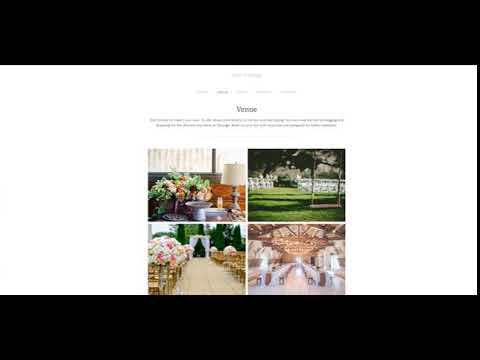
I think that Weebly’s ‘Cento’ wedding theme might be one of my favorite designs in this list so far! Not only is extremely clean with a lot of white space, but there’s lots of room for eye-catching imagery and important information too.
I’m a big fan of this template’s attention to the importance of imagery. Being able to show-off photos of your venue is a great way of creating a buzz and getting people excited. If guests can see how beautiful the venue is before they get to your wedding, imagine how blown away they will be when they arrive!
| Has this template got…. | |
|---|---|
| Multiple pages or is it single-page-scroll? | Single-page-scroll |
| A way to tell your story? | ✔ |
| A way for guests to instantly RSVP? | ✔ |
| Space for on the day logistics and details? | ✔ |
| Space for venue information + directions? | ✔ |
| An optional map for directions? | ✘ (not by default, but can be added) |
| An integrated registry? | ✘ |
| A gallery for photographs? | ✘ |
| Freedom to customize this template? | 8/10 |
“Clean Lines” Theme
Weebly’s ‘Clean Lines’ theme really reminds me of Squarespace’s ‘Charlotte’ template above. This is because both express content clearly and in an easy to read way, while still finding space to include lots of eye-catching imagery such as full-width photos or galleries.
| Has this template got…. | |
|---|---|
| Multiple pages or is it single-page-scroll? | Single-page-scroll (can add more pages if needed) |
| A way to tell your story? | ✔ |
| A way for guests to instantly RSVP? | ✔ |
| Space for on the day logistics and details? | ✔ |
| Space for venue information + directions? | ✔ |
| An optional map for directions? | ✘ (Can be added) |
| An integrated registry? | ✘ |
| A gallery for photographs? | ✘ |
| Freedom to customize this template? | 8/10 |
For more information on Weebly, check out the following:
Weebly Review – Find out about Weebly’s capabilities in our detailed review to see if it’s the wedding website builder for you.
Weebly Pricing Guide – We take a look at Weebly’s prices and explain the costs involved.
4) The Knot
“The Knot is a specialised wedding website builder that only makes websites for…you guessed it…weddings! Their template designs are all similar in terms of content – but vary massively in the look and design.”
The Knot provides around 150 theme designs, of which all of them are designed for wedding websites – which isn’t too surprising!
Unlike Wix and Squarespace, The Knot doesn’t provide massively different wedding template designs. Instead it uses the same structural skeleton and then stretches a new design over it instead.
Testing out different templates with The Knot is like test-driving the same car but in different colours, over and over. Whereas with Wix, trying each template out is like test-driving a different car each time.
This isn’t necessarily a bad thing as The Knot’s templates contain all the essentials you need, but if you’re after something a bit more eye-catching or unique then it might be worth considering some of the templates above.
“Fall” Theme
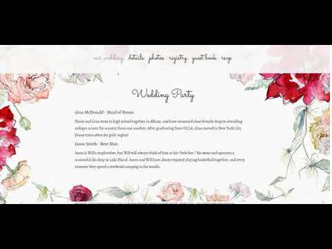
I’m a sucker for Fall’s delightful watercolor style flowers that frame the page designs, which help to push the reader’s attention to the important content in the middle of each page, ensuring guests don’t miss anything.
This is a very straightforward theme design and includes all the essentials in your top navigation bar, which keeps things organized and easy for guests looking for information.
| Has this template got…. | |
|---|---|
| Multiple pages or is it single-page-scroll? | Single-page-scroll |
| A way to tell your story? | ✔ (limited) |
| A way for guests to instantly RSVP? | ✔ |
| Space for on the day logistics and details? | ✔ |
| Space for venue information + directions? | ✔ |
| An optional map for directions? | ✘ |
| An integrated registry? | ✔ |
| A gallery for photographs? | ✔ |
| Freedom to customize this template? | 3/10 |
The Knot’s Floral template is very attractive and easy on the eyes, but lacks as much customization or personality of other templates we’ve looked at in this discussion. It would be a good choice for couples who want a wedding website but don’t want to spend too much time building.
“Colored Chalk-Black” Theme
‘Colored Chalk’ is a much more modern theme than ‘Fall’ (above). The colors are bold yet understated, with the black background adding more emphasis to the information you decide to add.
The single-page scroll keeps navigation simple and straightforward. This minimizes potential confusion from guests and communicates essential logistics clearly in easy-to-read fonts.
| Has this template got…. | |
|---|---|
| Multiple pages or is it single-page-scroll? | Single-page-scroll |
| A way to tell your story? | ✔ (limited) |
| A way for guests to instantly RSVP? | ✔ |
| Space for on the day logistics and details? | ✔ |
| Space for venue information + directions? | ✔ |
| An optional map for directions? | ✘ |
| An integrated registry? | ✔ |
| A gallery for photographs? | ✔ |
| Freedom to customize this template? | 3/10 |
Again, it’s worth stressing that The Knot is a lot more limited than the previous templates we’ve looked at, but its themes do include all the essential things you’d need on a wedding website. If you’re really in a rush then it’s worth looking at, but if you can spend even an hour or two more, then it’s worth looking at Wix or Squarespace for more inspiring wedding template designs.
5) Appy Couple
“Appy Couple is a specialized wedding website builder, that offers a large range of beautiful designs for you to try out. While it’s not as versatile as Wix or as pretty as Squarespace, it can take some of the stress out of creating a wedding website.”
Appy Couple provides several hundred wedding website themes for you to try out, which really does sound like a lot so if you get paralyzed by choice, beware!
However, much like The Knot, these are more theme changes than actual site-wide template designs. The only real change you can make is whether you want a single-page scroll website or a multi-page one.
This can limit the amount of customization you might want to do to make your site more unique.
“Eucalyptus” Theme
The ‘Eucalyptus’ theme is beautiful, smart and very professional looking. It reminds me of a slightly more upmarket version of The Knot’s ‘Fall’ theme (Above).
I think my favourite thing about this wedding template – aside from its beautiful design – is that it makes everything super convenient for guests, which is really important in my book.
| Has this template got…. | |
|---|---|
| Multiple pages or is it single-page-scroll? | Multiple pages |
| A way to tell your story? | ✔ |
| A way for guests to instantly RSVP? | ✔ |
| Space for on the day logistics and details? | ✔ |
| Space for venue information + directions? | ✔ |
| An optional map for directions? | ✘ (must add from editor) |
| An integrated registry? | ✔ |
| A gallery for photographs? | ✔ |
| Freedom to customize this template? | 2/10 |
“Midnight in Manhattan” Theme
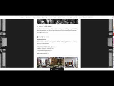
The ‘Midnight in Manhattan’ theme is a very high-end looking design that catches the eye and screams ‘this is going to be one heck of an evert!’
Despite being a single-page scroll design, there’s loads of room for you to share photographs.
Single-page websites are notoriously hard to balance between written content and images. This theme does a great job of helping you communicate essential information while also sharing the joy of the day itself.
| Has this template got…. | |
|---|---|
| Multiple pages or is it single-page-scroll? | Single-page-scroll |
| A way to tell your story? | ✔ |
| A way for guests to instantly RSVP? | ✔ |
| Space for on the day logistics and details? | ✔ |
| Space for venue information + directions? | ✔ |
| An optional map for directions? | ✘ (must add from editor) |
| An integrated registry? | ✔ |
| A gallery for photographs? | ✔ |
| Freedom to customize this template? | 2/10 |
CONCLUSION:
THE BEST WEDDING WEBSITE TEMPLATE FOR YOU
In the rundown above, you’ve seen some of the best wedding website templates around.
You should also have a better understanding of the key features you need to look out for on a wedding template.
Our recommended templates above look great and come packed with the features you need to save money, time and effort – so which one is best for you?
Remember, a template is a good starting point. But to make your wedding website your own, it needs to be easy to customize!
Taking into account looks, out-the-box features, and ease of customization, we reckon that Wix has the best choice of wedding templates around.
Wix’s templates are fun, eye-catching and full of handy features. They are the best choice for a memorable (yet practical) wedding website.
One of Wix’s major benefits is that it’s easy to make your template reflect your wedding day. The Wix editor is very intuitive so you can customize your template as much as you see fit.
Squarespace is a great choice if you want a high-end looking wedding website. Their templates include lots of images, so you’ll need to have the photographs to do the designs justice.
I like Weebly’s templates (sorry, themes!) because they have great out-the-box features and are easy to tweak if needed. Weebly’s themes are simple and attractive – a winning combo for any bride and groom in a hurry.
The Knot and Appy Couple have a lot of beautiful templates too. However, they essentially hang different designs over the same basic structure. They contain a lot of useful features, but you’ll find that both platforms limit the amount of customization you can make.
When you’re building your wedding website, we recommend choosing one of Wix’s templates. You’ll find them attractive, easy to edit, and feature rich – perfect for a stress-free wedding.
Found This Article Helpful?
Question – Did this discussion benefit you? Leave a comment below.
Do you know anyone who can benefit from this discussion? Send them this page or click on the share buttons on the left.
You’ll be helping us out by spreading the word about our website, and you’ll be helping them out!












2 comments