I’ll Show You How To Use Squarespace in 2025: A Beginner-Friendly Guide
If you click to purchase a product or service based on our independent recommendations and impartial reviews, we may receive a commission. Learn more
During our 2024 research, Squarespace was the easiest website builder we tested. With an intuitive interface, stunning designs, and a drag-and-drop editor, it’s an ideal builder for beginners and creatives.
In this guide to using Squarespace, I’ll walk you through the onboarding process, and the process of designing your site, adding extra functionality, and more. Check out the video below for a quick run-through of the basics, or read on for my step-by-step breakdown!
1. Setting Up Your Squarespace Website
Squarespace offers a 14-day free trial for new starters, letting you try out the website builder for yourself before you subscribe to one of its premium plans. I recommend making the most of this time to find out if Squarespace is right for you – it’s a great opportunity to test the editor and explore Squarespace’s features.
When I first signed up, I used my email address and set a password. There’s no need for card details at this time.
I was then asked two simple questions to assess what I needed from my website:
- What’s your site about? – I could choose from a selection of industries and website types, such as “Weddings” or “Gaming”, or input a unique answer
- What are your top goals? – I was asked to select as many website priorities as I wanted, with options such as “Get appointments” and “Build community”
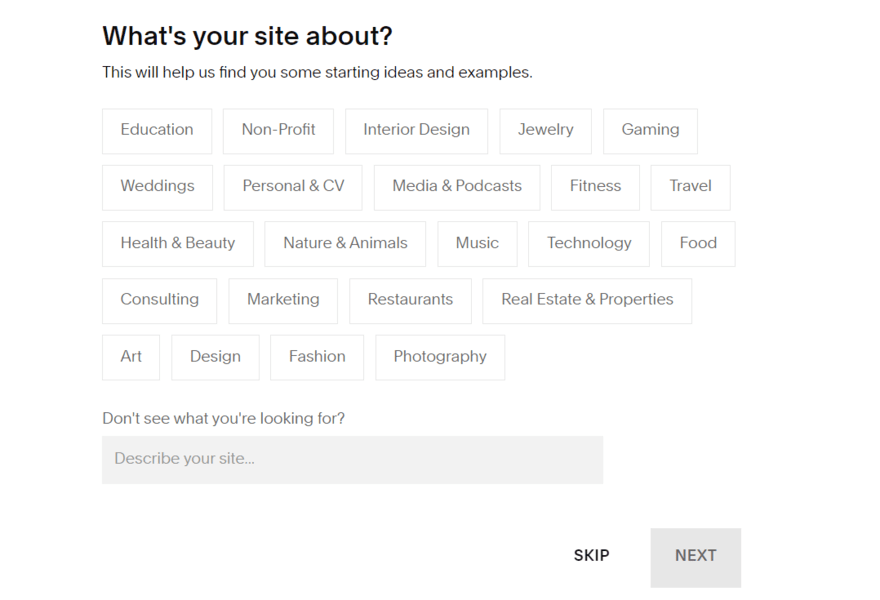
After answering, I clicked “Finish”, which redirected me to the template library. Squarespace showed me relevant template options based on the answers I gave to the two questions above.
Now, there are two options once you’re in the template library: choose a template or build your own template with AI. I’ll discuss Squarespace Blueprint – Squarespace’s AI template builder – in more detail later so, for now, let’s unpack Squarespace’s templates.

In the template library, I could filter the template options by type, such as “Blog” or “Memberships,” or I could view by topic, such as “Entertainment,” “Local Business,” or “Restaurants.”
There’s also a heart icon below each template, which you can click to favorite designs – I appreciated this option since I could mark templates as favorites and continue scrolling through the library without losing my top picks.
Before selecting a theme, I could preview the template and edit its basic color scheme using sample presets – you can edit individual HEX codes in the editor if you’ve already developed your branding. Still, the template preview is a great way to see the template in action for both desktop and mobile users, which is critical considering almost 60% of all website traffic comes from mobile devices.
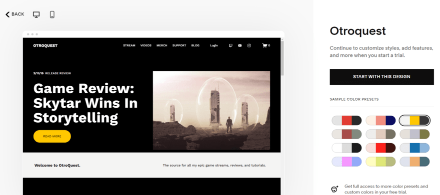
I chose a template and soon realized that I couldn’t swap to another once selected. This was an option on Squarespace’s previous 7.0 editor but it’s no longer allowed on Squarespace’s 7.1 editor. Thankfully, all templates come with the same features so it’s simply a case of tweaking the design to your liking. Still, I recommend you keep this in mind before locking in your final template choice!
Finally, Squarespace finished setting up my account by asking for my site’s name. After that I was in the dashboard, which is split into two core sections:
- A website preview – this gives you a quick look at your website, but you’ll need to click “Edit” in the top bar to start tweaking the design
- An account sidebar – the sidebar is where you’ll manage and oversee your account settings
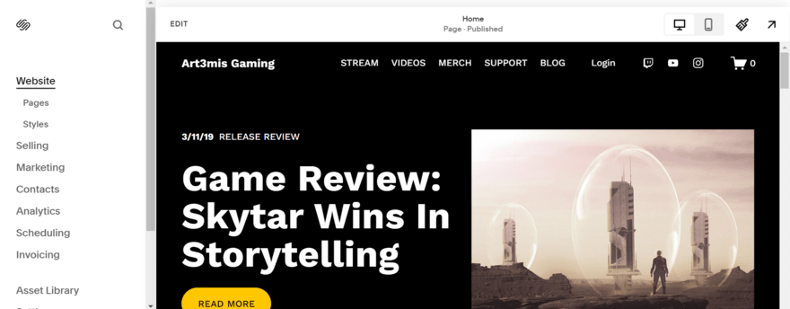
Here’s a quick look at what each sidebar section covers:
- Website – to review your pages and styling (such as font type) for the entire website
- Selling – for all things related to ecommerce, such as adding products, reviewing orders, and setting up discounts
- Marketing – create email campaigns, add promotional pop-ups, and more to reach your audience
- Contacts – keep tabs on your site’s engaged visitors, such as email subscribers
- Analytics – this is where you can monitor your site’s performance and review traffic
- Scheduling – set your availability and add booking types, such as group classes
- Invoicing – create and track client invoices
- Asset Library – a place to view your site’s media, such as images and videos
- Settings – tweak your website information, such as site languages and domain names
- Help – this directs you to Squarespace’s Help Center and 24/7 support channels
I’ll walk you through editing your Squarespace website in a later section.
2. Building With Squarespace Blueprint
Squarespace Blueprint first launched in May 2023. This guided web design system, powered by AI, simplifies the building process and saves you time with a five-step journey.
- Add your site’s name
- Create your homepage by selecting the sections and layouts you want
- Add pages to your website, such as a “Shop” or “Contact” page
- Choose a color palette from a range of preset options
- Set your font type
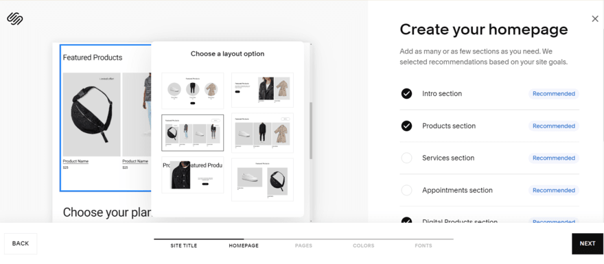
When testing, it took me around five minutes to finish setting up my website – depending on how much time you spend on each step, this could easily be done in a minute or so. Equally, you could spend longer with Squarespace Blueprint by exploring every option in detail.
Before progressing to the editor, Squarespace also encouraged me to use its AI text generator to personalize my website’s copy. I described my site and chose from a list of available writing styles to match the tone of my brand. Squarespace claims the process takes around 60 seconds, but in my experience, the copy took roughly 10 seconds to generate.
The next step is to carefully review the AI-generated content on your pages – something Squarespace recommends you do and is good practice when using any AI feature. I found that the AI tool did a great job on my test website and I only had to make minor changes here and there when in the editor.
3. Which Squarespace Plan Should You Pick?
How much will Squarespace cost after the 14-day free trial? Squarespace’s pricing ranges from $16 to $52 per month (billed annually), spread across four plans:
Squarespace Pricing Plans
- Personal ($16) – For online portfolios
- Business ($23) – For side hustles
- Commerce Basic ($28) – For growing small businesses
- Commerce Advanced ($52) – For larger online stores
While Squarespace doesn’t offer a free plan, its 14-day free trial is a good starting point to test things out. When it’s time to upgrade, the Personal plan is the cheapest option – it’s ideal for personal sites and portfolios, providing SEO tools and access to third-party integrations.
However, you’ll need the Business plan or above to start selling products online and accepting payments. I recommend the Commerce Basic or Commerce Advanced plan for established stores with more than a few products to sell. With these, you’ll unlock additional sales features, such as product waitlists and abandoned cart recovery.
No matter which plan you pick, you can save 10% by using our exclusive code “WBE10” at checkout.
Purchasing a Domain Name
Your domain name is your site’s address. For example, ours is websitebuilderexpert.com. It’s an important and necessary element since your website can’t be found or recognized without one.
So, how can you set up a domain name with Squarespace?
- Get a domain name for free with the first year of your annual plan – this is available with all Squarespace plans
- Purchase a domain name through Squarespace – a .com domain name will cost $12 per year with Squarespace for the first year, but will renew at $20 per year
- Buy from another domain registrar and transfer to your Squarespace website – it’s free to transfer your domain name to Squarespace, but you’ll need to pay for one additional year of domain registration with Squarespace (this will cost between $20 and $70)
4. Using Squarespace’s Editor
Like Wix, Squarespace uses the familiar drag-and-drop editor, meaning you can move elements and sections around a page easily when designing your web page layouts. However, Squarespace has an added smart grid to keep your design and structure in place. This is a great feature for beginners since it helps to align elements.
When testing, this grid structure did prevent me from moving an element exactly where I wanted it to go, so Squarespace lacks the same creative freedom offered by other builders, like Wix or Hostinger. Plus, there’s no autosave feature, so you must remember to click “Save” in the top left corner of the editor.
Still, Squarespace is the easiest website builder to use and wrap your head around because of its beginner-friendly editor and impressive designs. I understood the editor and its features in minutes.
Adding Pages
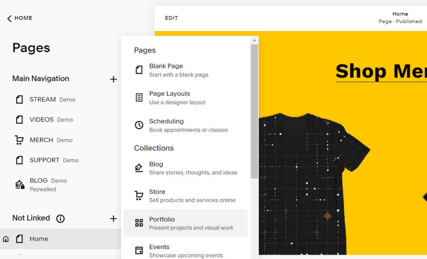
I had to add pages to my website from the account dashboard, rather than in the editor itself. This function can be found under the “Websites” section, named “Pages.”
This is where I could view my site’s navigation and tweak my pages’ settings for SEO purposes. When adding pages, there are 14 page types to choose from, including “Reviews” and “Privacy Policy” – these are like sections in the editor, offering several professionally designed layout options.
Depending on your template, you’ll likely have a selection of pages already installed. For example, my gaming website included a homepage, a video library, a shop for merchandise, a monetized blog, and a support page.
To remove unwanted pages, simply click the bin icon next to the relevant page.
Customizing Your Content
Squarespace uses a drag-and-drop editor with a smart grid, helping users keep elements aligned and pages tidy. It makes building a website as easy as snapping blocks into place.
The builder keeps things simple by removing unnecessary icons and sidebars – everything you need is accessible directly on the page. For example, if you want to add a new section, simply hover at the top of an existing section for the button to appear.
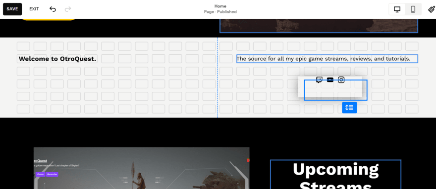
Editing text was as easy as clicking on the text and making my changes directly on the page. A familiar settings bar also popped up so I could tweak things like text style, alignment, and font size – this resembles what you’d find at the top of a Google Doc or Word document.
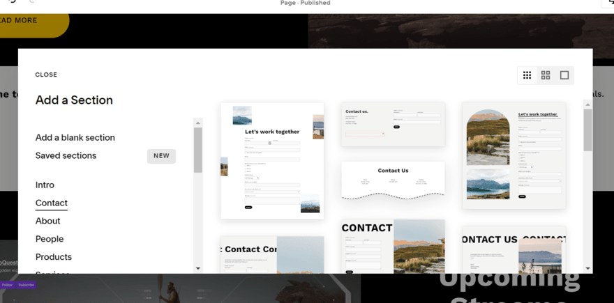
For the main structure, Squarespace builds its pages through sections. I clicked the button at the top of a section to open up the full library – this is organized by categories, such as “Intro,” “People,” “Forms,” and “Quotes.” Each section category has a range of styles and layouts to choose from, including dynamic content components, but I could tweak these further in the editor to better suit my website.
To add a block or element, all I had to do was hover over a section and select the “Add Block” option in the top left corner. Squarespace’s block library includes elements like social links, maps, and an Instagram feed.
I thought the templates were really professional looking and the design elements were super stylish. I love that there were some with moving elements and that each category had loads of options to choose from.

To put it simply, you’ll add sections to your pages first – these will sit on top of one another to create the overall structure. Blocks are then added to fill out these sections, but you can’t move blocks to and from other sections. To remove any elements or sections, select what you want to delete and click the red bin icon.
Create Consistent Branding
Your online branding is what makes your website come alive and stand out in the market. It also brings consistency across your pages, making your website more recognizable to visitors.
With Squarespace, editing things like your website’s font, color palette, button style, and animations falls under “Site Styles” – identifiable as a paintbrush icon in the top right corner of your editor or account dashboard. Any changes made here will be site-wide.
For example, Squarespace’s color palettes are made up of five core colors, and I could tweak these colors individually or choose from 36 preset palette options. Alternatively, I could upload an image and have Squarespace automatically generate a color scheme based on that. This is ideal for brands with set assets, like a logo or product image, to pull inspiration from.

Preview Your Site
Unfortunately, you can’t preview your Squarespace site from the editor – you need to click the arrow in the top right corner when in your account dashboard. This will expand the view of your site and let you see it as a visitor would. To return to the dashboard, click on the arrow again.
I recommend getting friends, family, colleagues, or total strangers to run their eyes over your website before you publish it. This is a great way to catch any mistakes and test the user journey so you can make improvements ahead of launch.
5. Building an Online Store
This is an optional stage when using Squarespace, but if you’re looking to sell online, you’ll need to make sure your site has ecommerce functionality. During our tests, we found Squarespace to be one of the best ecommerce website builders, sitting just behind Shopify and Wix in our ranking.
With Squarespace, you must be subscribed to the Business, Commerce Basic, or Commerce Advanced plan to unlock sales features.
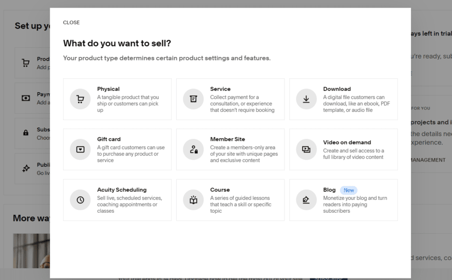
You can access Squarespace’s ecommerce tools from the “Selling” section in the sidebar. This features a checklist of steps to complete in order to set up your online store:
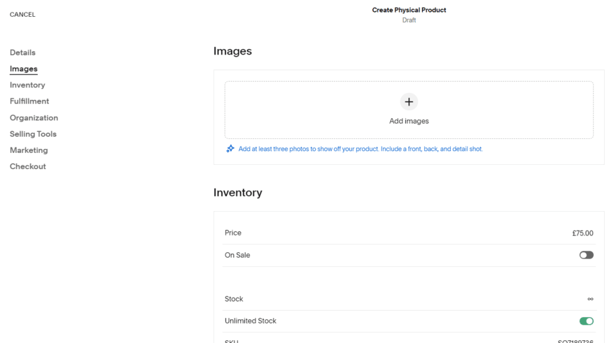
- Add products to your inventory – choose from a diverse range of product types (including physical products and courses) and fill out the product page with relevant information, such as name, description, product photos, and variants
- Add a way to get paid – set up a payment gateway and processors to give your customers a choice of how to pay at checkout
- Choose a subscription plan – make sure you’ve upgraded to the Business plan or above to unlock ecommerce features
- Publish your website – push your site live to start selling products to customers
When testing, I found it incredibly simple to add new products to my Squarespace inventory. I also really appreciated the helpful tips provided by Squarespace when adding product descriptions and imagery – this is a really neat feature for beginners or anyone less tech-savvy.
To accept payments, you’ll need a payment gateway or third-party processor. Squarespace Payments, the builder’s new native gateway, is currently only available for US merchants. It’s also less developed than its competitors, such as Wix Payments and Shopify Payments, both of which support more countries.
You can choose an alternative payment processor, such as Stripe or PayPal, instead of Squarespace Payments, but all options charge processing fees. With Squarespace Payments, you’ll incur a processing fee of 2.9% + $0.30 per transaction. And, you’ll only be able to remove transaction fees if you subscribe to the Commerce Basic or Commerce Advanced plan – Squarespace’s Business plan charges 3% per transaction.
Selling Services
Squarespace is ideal if you’re looking to offer appointments and sell services. I could add new services in the same way as adding products, by simply filling out a detailed form.
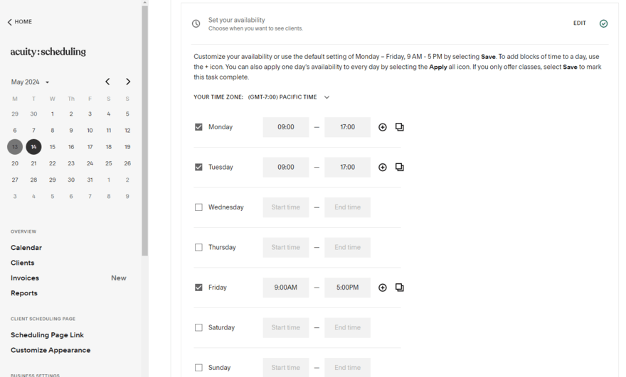
However, the main hub for services can be found under the “Scheduling” section of Squarespace’s dashboard. This directed me to Acuity Scheduling – Squarespace’s primary tool for taking appointments and bookings online. You’ll need a separate subscription to use the feature, with pricing ranging from $16 to $49 per month (billed annually).
From here, I could create new appointments, set the duration and price, and share my availability. Like the main “Selling” page, the scheduling dashboard features a checklist of steps to help users complete their setup – from designing your scheduling page to promoting it to potential customers.
6. Squarespace Extensions: Adding Apps
Squarespace’s app market is known as Squarespace Extensions, and allows you to browse 40+ third-party apps to add extra functionality to your site. This is a far smaller selection than other builders have, such as Shopify, which offers thousands of apps in comparison.
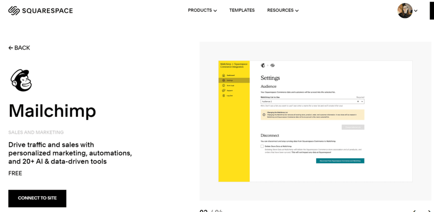
Some apps are free to use while others have premium plans. Once you pick an app you’re interested in, click to connect it to your site and select the relevant website to apply it to. Next, you’ll need to review the permissions and select “Allow” if you’re happy to proceed.
Depending on the app, you’ll have to complete a few additional setup steps to sync accounts across platforms – for example, you’ll need to do this to set up Mailchimp. In my experience, Squarespace Extensions isn’t as seamless to use as Wix’s app market.
7. Marketing Your Squarespace Website
Squarespace’s marketing features can be found under “Marketing” in the dashboard sidebar, encompassing things like email marketing and promotional elements. This is an important stage in building a website since you want to engage with your target audience effectively.
Search Engine Optimization
Squarespace ranks third in our list of the best SEO website builders, providing a suite of built-in features to help optimize your website, including a Google Search Console integration so you can review keywords and traffic across your pages.
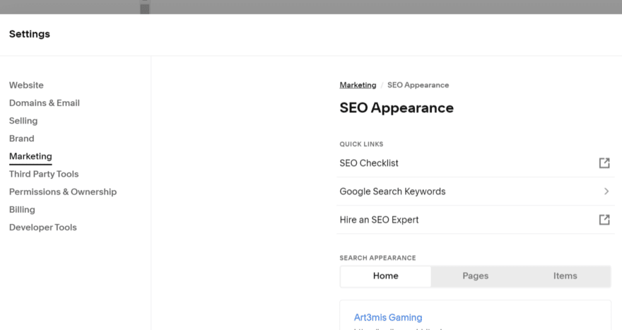
When testing, I could edit my site’s SEO appearance in the settings or tweak my page SEO directly to add metadata. Squarespace’s SEO settings also provide helpful resources, including an SEO checklist from the Help Center which walks you through optimizing your site. However, this isn’t as good as Wix’s personalized SEO report.
Still, if you feel like you need an extra helping hand with SEO, you can hire a professional from a pool of trusted Squarespace Experts. This is great if you’re short on time and have the budget to spare, but I recommend brushing up on your SEO skills anyway since it’s valuable knowledge to have as a website owner.
Email Marketing
Get expertly designed email marketing campaigns to connect and engage with your audience using Squarespace’s Email Campaigns feature. During my time using Squarespace, I created multiple campaigns on varying topics. This was easy to do thanks to the diverse range of templates, such as email blasts, welcome emails, product recommendations, and even seasonal templates.
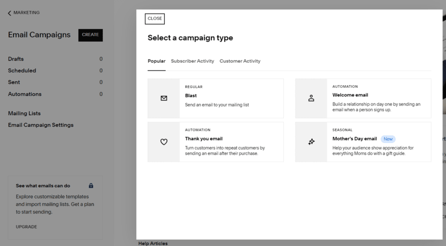
Each campaign type gave me different designs and layouts to choose from – something you’d expect from Squarespace given the quality of its website elements and templates.
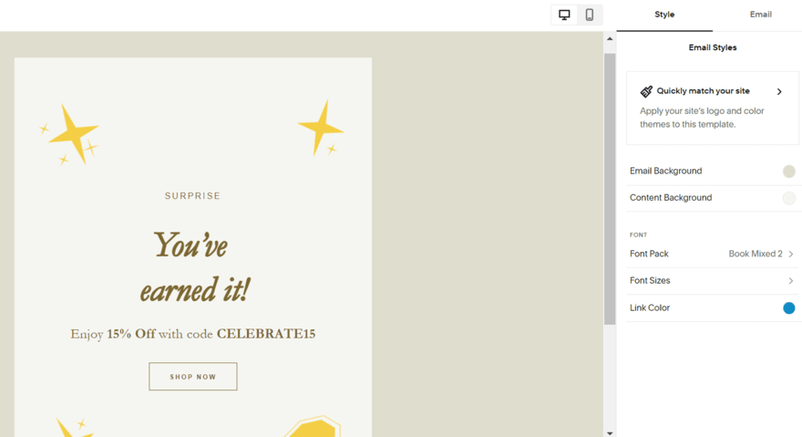
After I selected a template, I could tweak the content inside and preview the finished look. I appreciated the ability to match my email template to my website’s site style too, since this helped me create a cohesive look across my messaging.
The Email Campaigns tool is available across all Squarespace plans, but you’ll be limited to building mailing lists, creating email drafts, and sending three trial blast campaigns.
For more features and the ability to send additional campaigns, you’ll need to purchase an Email Campaigns plan. This is separate from your site subscription, and the plans range between $5 and $48 per month (billed annually).
Social Media
Squarespace offers a few different ways to connect your website with social media platforms. For starters, I could add social links to my pages using blocks or pre-designed sections. All I had to do was connect my social accounts within my settings – Squarespace recognizes all popular social media platforms, including Facebook, Instagram, LinkedIn, Pinterest, TikTok, YouTube, and X/Twitter.
Once connected, you can share your social media content across your website seamlessly. And vice versa! Squarespace provides built-in sharing options, meaning you can publish a blog post and send it to your social media platforms instantly.
In addition, I recommend using Squarespace’s Unfold app to generate social content, such as Instagram stories. The toolkit provides hundreds of templates, filters, effects, and stickers. It’s free to use, but you can upgrade your plan to unlock additional assets and editing tools.
You can also use Squarespace’s Bio Sites to create a personalized link in bio template to share across platforms, such as TikTok or Instagram. This lets you create a custom one-page website – sort of like a mini portfolio page – to share your work, products, and social links in one central place. Plus, it only takes a minute to set up this stylish alternative to a basic link in your bio.

How To Use Squarespace: A Quick Walkthrough
Squarespace is the easiest website builder I’ve tested, providing impressive features and a beginner-friendly editor that helps you create professional-looking pages. I’ve guided you through the website builder from start to finish, covering the onboarding process, using Squarespace Blueprint, marketing your site, and more.
You can find out if Squarespace is the right fit for your website by making the most of its 14-day free trial. I also recommend reviewing the best Squarespace alternatives if you want to explore other options ahead of committing to a plan.
4 comments